Alpes 2009
Here is many pictures I did during my stay in Valley of Charmonie in the very exiting place called les Houches. At that time I were trying to make pictures looks like originals. I also did not realy care, at least at the begginig, about how many times the color is applied and were felling free to put dark green over bright one, and if the effect was not strong to add some more green, and then if the situation is too bad then add some very very dark green. It seems at the end of my stay I somehow get the idea of non mixing of colors on the paper. Pictures are inverted in chronological order, more or less, earlier are on the top.
View from my window
----------------------------------------------------------------------------------------
View from my window - just another day
-----------------------------------------------------------------------------
And another day
----------------------------------------------------------------------------------------
----------------------------------------------------------------------------------------
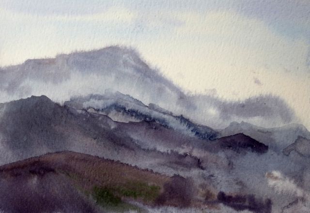
Mountain chains
----------------------------------------------------------------------------------------
Aiguille du Midi
----------------------------------------------------------------------------------------
Green Mountain - last picture


